During my time in Term 4 of CSD, I was introduced to various Algorithms and I was paprticularly interested in the applications of the graph algorithms to the real world context.
This was my motivation for this project.
One of the Graph Algorithms that I learnt was Dijkstra’s Algorithm, where the algorithm finds the shorest path from a source node to a destination node, given a non-negative weighted graph.
I am also someone who frequently take public transport and most of my transport time is spent on the train.
Since I have quite a few minutes to spare on the MRT, I spend my commute time coding (P.S. I am doing this while on MRT as well haha)
One day, I had an idea that sprung up my head about making the Map of the MRT stations and running Dijkstra’s algorithm on it bringing me to this project.
How is the map created?
Each station on the map is represented by an object “Station” in the Vertex.py and a Station is defined by its name, colour, edges, distance and a reference of the previous station. The first 3 attributes are crucial in creating a unique station and the last 2 is crucial in storing the information while running the Dijkstra’s Algorithm.
Each ‘connection’ is represented by an object “edge” defined by its origin, destination and weight- time taken to travel from origin to destination
Using multiple helper functions, the stations and the edges are created through looping over the list of the station names and the durations. Each MRT line is created in isolation and once all the lines are created, we connect one line to another using the interchanges.
Tada! We have our MAP!
Functions
 search (string)
 - returns a list of station names containing the input string
 getAdjacencyListOf(station)
- returns the Adjacency List of the input station - Adjacency List is the list of the neighboring nodes in the graph, in this case they are the next stations from the station in all directions.
getShortestPath(origin, destination)
 - returns a list of stations along the shortest path from origin to destination
 getShortestTime(origin, destination)
 - returns time taken for shortest path from origin to destination
If you would like to play around with the code, here’s the link to the github repo of this code. Try it!
In the code implemented here, it only accounts for the time taken for the MRT to travel from A to B and it fails to account for the walking time at the interchange and therefore, the results might not be as accurate.
Deep Learning at first glance sounds very complicated. What if I tell you, it is not as complicated as you think.
This blog will explain to you the basics of how Deep Learning works. You would have to be comfortable with seeing a lot of differential equations and know a little bit of Linear Algebra.
Perceptron
What is a perceptron?
Perceptrons in Deep Learning are essentially the same as neurons in the human brain.
How does the human brain work?
At this point, it is important to explain how the human brain works. The human brain consists of a vast network containing billions of neurons.
When we receive information, certain neurons fire to process this information. And when we receive the similar information in the future, the same sets of neurons get fired and that is how we recognize that this information is something we have seen before.
This is what we call learning.
One example of which can be picture books that children use to identify animals.
How can we apply the concept of neurons to the perceptron?
Just like how certain neurons fire when a similar information is provided, we can define perceptrons in such a way that certain perceptrons in the neural network get activated when we give them a similar information.
When information is provided, there are only two states to a single neuron. It fires or it doesn’t.
We can apply this to the perceptron in a binary format and assign the perceptron that fires “1” and assign “0” if the perceptron doesn’t fire.
How does a perceptron work?
Let’s start off with a simple example. The diagram below there are 3 inputs (x) and a bias term connected to a perceptron and each connection has its own weight (w).
From the diagram, both the inputs and the respective weights can be written as matrices:
From this, we can express the expression for ŷ as follows:
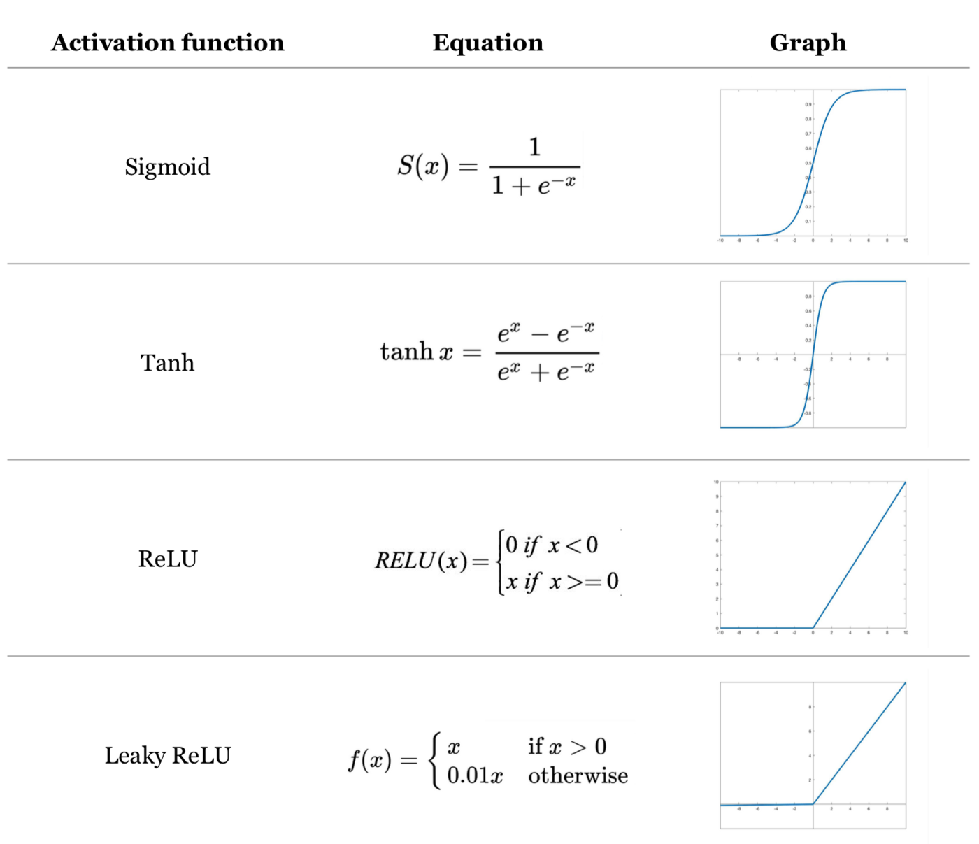
Non-Linear Activation Function
After attaining the weighted sum, we apply one of the non-linear activation function.
The most commonly used and easiest to understand would be “ReLU”, but there are other activation functions such as “tanh” and “sigmoid” as well.
All this calculation is just for one perceptron and we would have to compute for every perceptron in our neural network.
And we can have several hidden layers and it might look something like this:
Backpropagation
This is the most crucial part of Deep Learning as this is essentially where the “learning” takes place.
During the first forward propagation, the weights are assigned randomly and the loss function would be too large.
If you ask the computer to classify between images of dogs and cats the results would not be any different from a coin flip. (Well that’s just not good.)
That’s why we have to work backwards to update our weights to ensure that the predictions can fit the expected results.
The expression for optimization of the loss function with respect to the weight can be obtained through applying chain rule as shown below.
This formula can be used to attain the values of all the weights in the neural network (w1, w2, …) such that it outputs the minimum value of J(W).
This algorithm is also known as Gradient Descent. I have a blog on that too! Check it out here.
As we repeat this forward and backward propagation for several iterations, the computer learn to recognize patterns in the data and the predictions become increasingly accurate.
Gradient descent is an iterative algorithm for finding a local minimum of a differentiable function. This blog post will be a quick explanation of how it works and its application in deep learning.
In deep learning, we have something called a loss function and it is defined by how far off the predictions are to its true value.
Some of the loss functions include Mean Squared Error(MSE), Mean Absolute Error(MAE) and Cross-Entropy.
In order for the predictions to be more accurate, we have to minimize the loss function through gradient descent.
Gradient Descent on single variable function
Let’s start off with something simple to get an intuition of how Gradient Descent works.
We have a function f(x) and we will be using gradient descent to get the local minimum of f(x). f'(x) is also shown below for reference.
f(x) = x² -8x +4 f'(x) = 2x -8
The algorithm for the gradient descent is given by this equation:
In this equation, the new value of X, is given by the current value of X minus the n(learning rate) multiplied by the gradient at the current value of X. The first value of X is usually a random guess in the range of x. n can be thought of as a “step size” and is a positive arbitrary constant.
If a function concave upwards, and the initial X value is towards the right of the minimum point, the derivative will be positive.
This means that the subsequent X value would be less than the previous X value and this results in a convergence towards the minimum point of the function.
I have added an animation to help you visualize to understand this better. The algorithm is ran for 30 iterations with n=0.2
Here’s the output of the algorithm, Notice that the first few iterations, it converges very quickly. However, it gradually converges at a slower rate with increasing iteration.
You can think of the Gradient descent algorithm as rolling down a ball into the curve. The algorithm ensures that the “ball” ends up at the local minimum.
Common Challenges
The algorithm might not give the global minimum value
In the above given example, it was a square function and therefore only has one minimum point.
However, as functions get more complex, there might be multiple minimum points.
Here’s a sample of a function g(x) with two minimum points.
From the graph above, we can clearly see that the global minimum occurs at roughly x =20.
However, when we run the same algorithm for 30 iterations on the graph of g(x), with n= 0.2 , the result shows the local minimum point at roughly x=-2.
This means that the gradient descent algorithm does not necessarily converge to the global minimum point and thus it has limitations in minimizing the loss function.
One way to get around this is by repeating the algorithm several times with different starting points.
When deciding the learning rate, we must ensure that it is not too small as very small learning rate would result in slower convergence towards the minimum point.
The algorithm is ran for 30 iterations on the graph of f(x) with n=0.01.
Now that we have some idea of how gradient descent works with single variable(x), we are going to take a step further to see how it works with two variables (x,y).
Here’s a plot of h(x,y) on a 3d plot, and their partial derivatives for reference.
h(x,y) = x2 + y2 hx = 2x hy = 2y
Just like we did with the single variable function, we are going to apply the same algorithm.
But now that we have two variables, we would have to apply the algorithm to both the variables x and y.
By applying the algorithm for both x and y, for 30 iterations at n=0.1.
In this blog post, we are going to compare 3 different types of plots to help you visualize the distribution of data using seaborn. We will also mention advantages and disadvantages of each plot so that you can choose the most suitable plot when you are plotting 😀
### import relevant libraries
import pandas as pd
import seaborn as sns
import matplotlib.pyplot as plt
%matplotlib inline
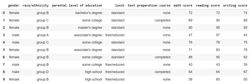
For this blog post, we will be using Student Performance in Exam dataset from kaggle here.
Just for reference, this is what the data looks like.
### reading the csv file
df= pd.read_csv("StudentsPerformance.csv")
df
Box plot
This is the simplest and easiest to understand of all the plots in the blog.
The box represents the interquartile range (IQR) of the data, from 25 percentile(Q1) to 75 percentile(Q3).
The line within the box represents the mean value.
The two tails represent the Lower Adjacent Value(Q1 – 1.5*IQR) and Upper Adjacent Value(Q3 + 1.5*IQR).
The data points outside the tails represents the outliers in the dataset.
When we plot the math scores across the different races from the dataset, this is what we get.
fig, ax = plt.subplots(figsize=(16,8))
fig = sns.boxplot(y= "math score", x= 'race/ethnicity',data= df.sort_values('race/ethnicity'), ax=ax).set_title("Distribution of Math Scores")
We can subdivide these box plots of the math scores of different races into male and female math scores as well.
fig, ax = plt.subplots(figsize=(16,8))
fig = sns.boxplot(y= "math score", x= 'race/ethnicity', hue = 'gender' ,data= df.sort_values('race/ethnicity'), ax=ax).set_title("Distribution of Math Scores")
Advantages – Simple and easy to understand
Disadvantages – May not be as visually appealing as other plots
Violin plot
Violin plot is very similar to box plot in terms of what it represents but with much more to offer.
At the center of the violin, the white dot represent the mean value, the bold line represent the interquartile range, and the faint line represent the Lower and Upper Adjacent Values.
You may be wondering what additional information does this violin shape contain. Well it is pretty simple.
The width of the violin (Density plot width) represent the frequency of the data at that value which roughly correlates to the likelihood or the probability of attaining that value.
Moreover, we can split the violin to represent the data separately for categories with 2 labels.
For this dataset, we can split the violin and have one side represent the scores of male students and another side represent the scores of the female students.
For the plot below, I have plotted the violin plots of the math scores across the different races and further divide them into gender.
Advantages – Include frequency of the values in the data – Includes the probability of getting the value – Can be divided to represent 2 demographics
Disadvantages – The mean, IQR and Lower and Upper Adjacent Values are not as explicit and outlier values are difficult to see – Gives a misleading notion that a student can score lower than 0 or higher than 100.
Swarm plot
Swarm plots are essentially the same as the violin plot, but instead of having a smooth curve to represent the frequency of the data, swarm plot just plots a data point.
Same as before, let us plot the distribution of the math scores to see how it looks like.
When we plot the same data as from the violin plot above, the results plot also accounts for the uneven distribution of the race/ethnicity in the sample size.
Advantages – Outliner values are shown clearly – Accounts for the different in the size of categories in the sample size – Rough distribution of the data can be seen
Disadvantages – Mean, IQR and Lower and Upper Adjacent values are no longer present. – Cannot split the swarm to see the distribution unlike violin plots.
Conclusion
To be very honest, if you were to ask me “What is the best plot?” I would say, it really depends on what you want to achieve.
Some plots offer features that others doesn’t so it is really a trade off that you have to consider when you are choosing between these plots.
The objective is to determine if a certain tweet is referring to an actual disaster or not.
This is a brief blog post on how to use deep learning to predict if the tweets are talking about actual disasters.
I used Google Colab for my project to use their GPU to run the code faster.
Disclaimer: This is a code which I have written and it may or may not be the most efficient method. If you have any suggestions or feedback, I am willing to receive constructive feedback.
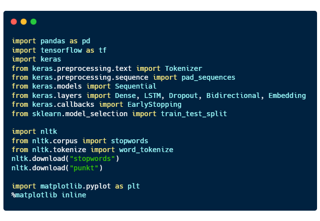
Importing relevant libraries
Here are the purposes of each libraries imported:
pandas for processing data
tensorflow and keras for deep learning
nltk, natural language toolkit for natural language processing
matplotlib for plotting graphs
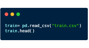
Reading the csv file
Using pandas, we can read the csv file. “train.head()” will return the first 5 rows of the dataset.
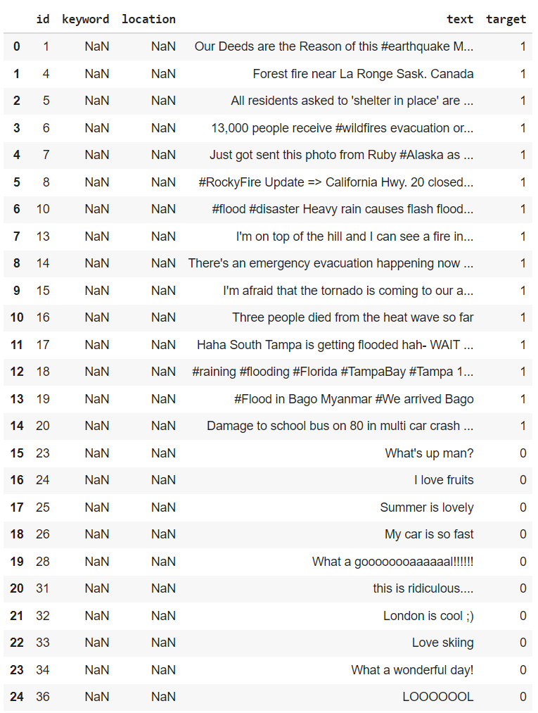
Here’s a sample of what is inside
From here, we can see that disaster tweets are denoted by the target value of “1”, and if they are not, they are assigned the target value “0”.
Data Cleaning
As we can see from the figure above, the data can contain a lot of not very useful information such as the columns “keyword” and “location” as they are mostly empty values.
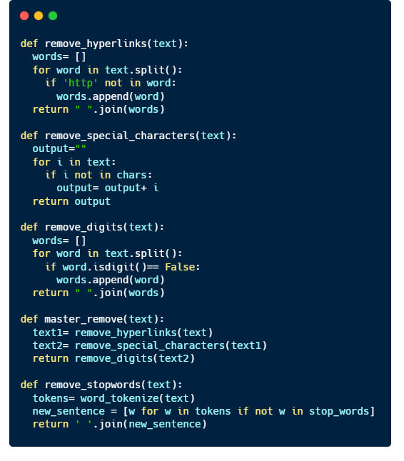
So before we give the computer to understand what we are saying, we have to clean up the mess in the data.
We will do just a simple data cleaning which consists of
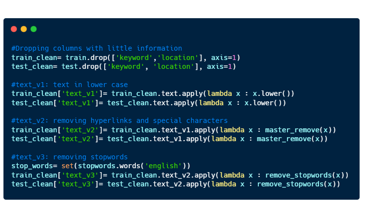
Dropping the columns “keyword” and “location”.
Making all text to be in lower case
Removing hyperlinks and special characters (#, @, %, … )
Removing stopwords.
Before we move on, here’s a very brief introduction to what are stopwords. Stopwords are words that does not contain much information. They are mostly pronouns, prepositions, and conjunctions. Here are some samples of stopwords:
Let’s write some functions to make our data cleaning a little bit easier 🙂
Implement the code to the training and test datasets.
Here’s a sample of how an entry looks like after data cleaning.
id                            38
text       Was in NYC last week!  #original text

text_v1    was in nyc last week!  #lower case
text_v2     was in nyc last week  #special character removed
text_v3            nyc last week  #stopwords removed
target                         0
Tokenization
Now that we have our data cleaned, we can now give it to the computer to do the ‘learning’.
Well not exactly.
Computers understand numbers better than they understand English, so we have to somehow convert our texts to numbers. That’s when we have to do Tokenization.
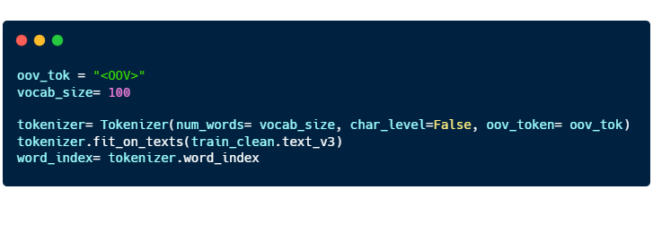
How it works.
You can think of tokenization as a 1-1 function. There exists one and ONLY one number that correlates to one English word.
In the code above, we are using the words from “train_clean.text_v3” to form a dictionary consisting of English words and its corresponding numerical value.
“oov_tok” is a token that is assigned to words that are out-of-vocabulary.
“vocab_size” is the number of tokenized words you want to keep. Only the most common words are kept.
“char_level” is put as False. If True, every character will be treated as a token.
When training the model, we have to divide the training dataset into 2 separate two groups of data. Training data and Validation data.
You can think of machine learning/ deep learning like drawing a best fit curve on a scatterplot. With just the training dataset, you can definitely draw a curve passing through all the points, and you obtain a model with very high accuracy on a training dataset as your mean squared error is zero.
However, data in real world are subjected to errors and thus, the model that you developed may not reflect the general trend that occurs in reality.
This leads to overfitting and to avoid this from happening, we have to have a validation dataset to ‘check’ to ensure that the model is able to be applied to a larger context.
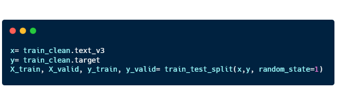
Here’s the code for “train_test_split”:
X_train, X_valid: “text_v3” training and validation
Y_train, Y_valid: “target” training and validation
Padding
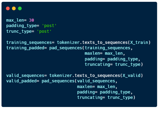
The final step we have to do before we train the model is padding.
Language consist of sentences with varying lengths, but computers can only learn when the input is of the same length for all sentences. So we have to fill in the gaps for shorter sentences by padding them.
“max_len”: maximum length of the sentence
“padding_type” : sentences will be padded at the end
“trunc_type”: sentences longer than max_len will be cut short from the back
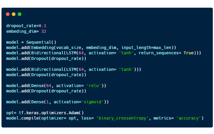
Building a model
The model consists of 4 layers: 2 Bidirectional LSTM layers and 2 Dense layers.
Embedding is a way to represent words using dense vectors in a continuous vector space.