Introduction
In this blog post, we are going to compare 3 different types of plots to help you visualize the distribution of data using seaborn. We will also mention advantages and disadvantages of each plot so that you can choose the most suitable plot when you are plotting 😀
### import relevant libraries
import pandas as pd
import seaborn as sns
import matplotlib.pyplot as plt
%matplotlib inline
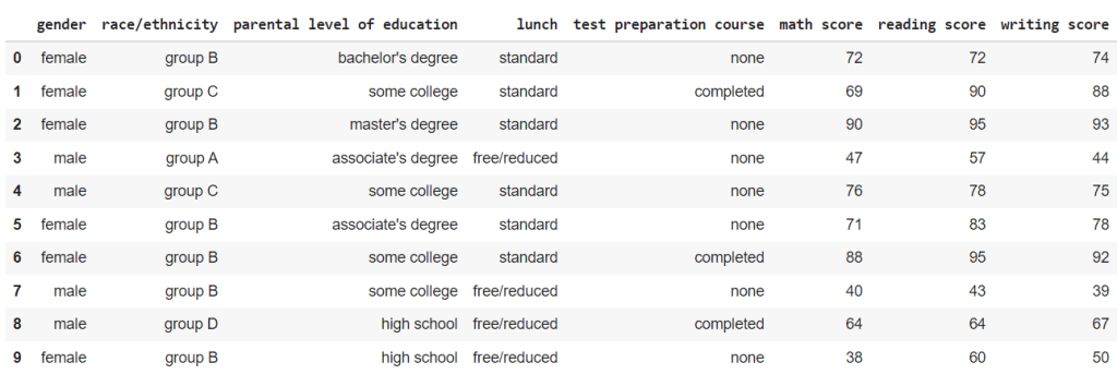
For this blog post, we will be using Student Performance in Exam dataset from kaggle here.
Just for reference, this is what the data looks like.
### reading the csv file
df= pd.read_csv("StudentsPerformance.csv")
df
Box plot
This is the simplest and easiest to understand of all the plots in the blog.
The box represents the interquartile range (IQR) of the data, from 25 percentile(Q1) to 75 percentile(Q3).
The line within the box represents the mean value.
The two tails represent the Lower Adjacent Value(Q1 – 1.5*IQR) and Upper Adjacent Value(Q3 + 1.5*IQR).
The data points outside the tails represents the outliers in the dataset.
fig, ax = plt.subplots( figsize=(6,2) )
fig= sns.boxplot(x= "math score", data= df , ax=ax).set_title("Distribution of Maths Scores")

When we plot the math scores across the different races from the dataset, this is what we get.
fig, ax = plt.subplots(figsize=(16,8))
fig = sns.boxplot(y= "math score", x= 'race/ethnicity',data= df.sort_values('race/ethnicity'), ax=ax).set_title("Distribution of Math Scores")

We can subdivide these box plots of the math scores of different races into male and female math scores as well.
fig, ax = plt.subplots(figsize=(16,8))
fig = sns.boxplot(y= "math score", x= 'race/ethnicity', hue = 'gender' ,data= df.sort_values('race/ethnicity'), ax=ax).set_title("Distribution of Math Scores")

Advantages
– Simple and easy to understand
Disadvantages
– May not be as visually appealing as other plots
Violin plot
Violin plot is very similar to box plot in terms of what it represents but with much more to offer.
At the center of the violin, the white dot represent the mean value, the bold line represent the interquartile range, and the faint line represent the Lower and Upper Adjacent Values.
You may be wondering what additional information does this violin shape contain. Well it is pretty simple.
The width of the violin (Density plot width) represent the frequency of the data at that value which roughly correlates to the likelihood or the probability of attaining that value.
fig, ax = plt.subplots(figsize=(6,2))
fig = sns.violinplot(x= "math score", data= df, ax=ax).set_title("Distribution of Maths Scores")

When we plot the math scores across the different races from the dataset, we get something like this.
fig, ax = plt.subplots(figsize=(16,8))
fig = sns.violinplot(y= "math score", x='race/ethnicity',data= df.sort_values("race/ethnicity"), split=True, ax=ax).set_title("Distribution of Maths Scores")

Moreover, we can split the violin to represent the data separately for categories with 2 labels.
For this dataset, we can split the violin and have one side represent the scores of male students and another side represent the scores of the female students.
For the plot below, I have plotted the violin plots of the math scores across the different races and further divide them into gender.
fig, ax = plt.subplots(figsize=(16,8))
fig = sns.violinplot( y= "math score", x='race/ethnicity',hue='gender',data= df.sort_values("race/ethnicity"), split=True, ax=ax).set_title("Distribution of Maths Scores")

Advantages
– Include frequency of the values in the data
– Includes the probability of getting the value
– Can be divided to represent 2 demographics
Disadvantages
– The mean, IQR and Lower and Upper Adjacent Values are not as explicit and outlier values are difficult to see
– Gives a misleading notion that a student can score lower than 0 or higher than 100.
Swarm plot
Swarm plots are essentially the same as the violin plot, but instead of having a smooth curve to represent the frequency of the data, swarm plot just plots a data point.
Same as before, let us plot the distribution of the math scores to see how it looks like.
fig, ax = plt.subplots(figsize=(8,6))
fig = sns.swarmplot(x= "math score", data= df, ax=ax).set_title("Distribution of Maths Scores")

When we plot the same data as from the violin plot above, the results plot also accounts for the uneven distribution of the race/ethnicity in the sample size.
fig, ax = plt.subplots(figsize=(16,8))
fig = sns.swarmplot( y= "math score", x='race/ethnicity',data= df.sort_values("race/ethnicity"), ax=ax).set_title("Distribution of Maths Scores")

However, when we further subdivide the swarm plot into genders, the plot can get very messy very quickly.
fig, ax = plt.subplots(figsize=(16,8))
fig = sns.swarmplot(y= "math score", x='race/ethnicity',hue='gender' ,data= df.sort_values(["race/ethnicity"]), ax=ax).set_title("Distribution of Maths Scores")

Advantages
– Outliner values are shown clearly
– Accounts for the different in the size of categories in the sample size
– Rough distribution of the data can be seen
Disadvantages
– Mean, IQR and Lower and Upper Adjacent values are no longer present.
– Cannot split the swarm to see the distribution unlike violin plots.
Conclusion
To be very honest, if you were to ask me “What is the best plot?”
I would say, it really depends on what you want to achieve.
Some plots offer features that others doesn’t so it is really a trade off that you have to consider when you are choosing between these plots.
